Experiments in Visualization
by Alison Hedley
In the summer of 2018, I used RAWgraphs to make a series of visualizations that accompanied a paper given for the Canadian Society of Digital Humanities (CSDH-SCHN). These mark the beginning of a new phase of the Personography, one that involves more in-depth visual analysis of our dataset.
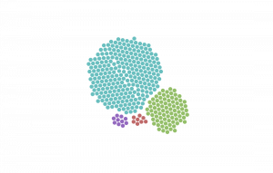
This pair of packed circle visualizations was created using RAWGraphs. The two images display the distribution of assigned sex across the persons in our data, which encompasses four categories: m (male), f (female), u (unknown), and o (other). The graphic on the left includes only the assigned sexes of magazine contributors; the graphic on the right includes the sexes of all magazine contributors and non-contributors who are in the Personography. As you can see, the distribution is almost the same in both cases, and the ratio is quite skewed toward males.

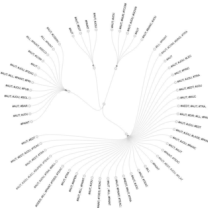
This circular dendrogram was created using RAWGraphs. The visualization displays every unique string of occupations that appears in the dataset of contributors, organizing them by assigned sex. As you can see, the array of occupations held by females was much larger than the array held by males: female contributors to the Personography held a wider variety of occupations than did males. This pattern may be the result of gendered workforce expectations in 1890s Britain. It was easier for men to access the education and socio-professional networks needed to get and keep a vocational job, so women were more likely to have multiple occupations, even though a wider range of occupations was available to men to select from.